ألوان الأفلام
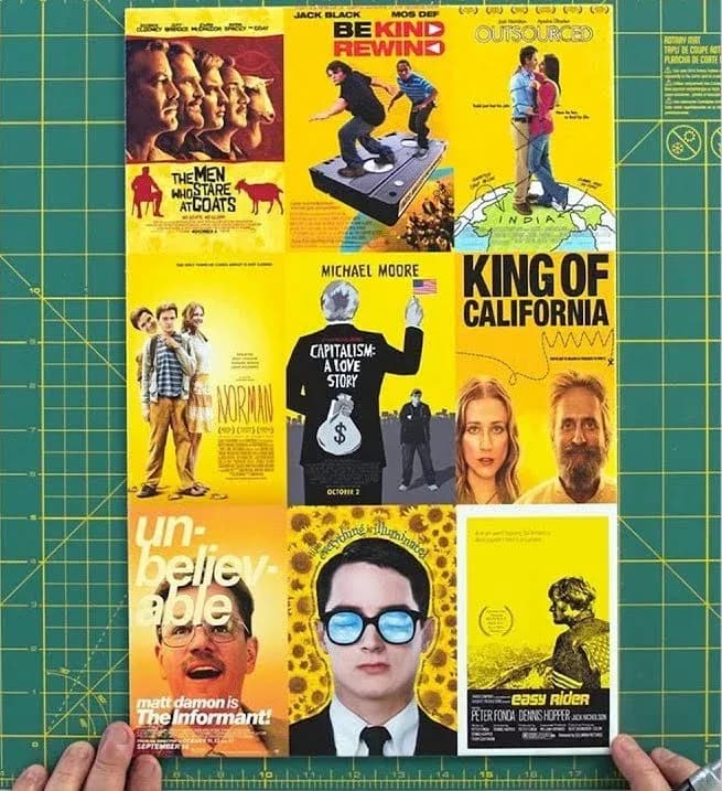
في المرة القادمة التي تسوّق فيها لفيلم مستقل، استخدم الأصفر.
التدوينة
We feel like everyone already kind of knows this, but it’s still interesting to see the guy who created the posters for Pulp FicColtion, Ocean's Eleven, Girl, Interrupted, and Training Day, (plus many many more) break down the colour theory and design of movie posters.
Two key takeaways:
1. When you’re marketing your next indie film, yellow is a cheap way to catch the eye.
2. Always use the face of Tom Cruise if he’s in your film. If he’s not in your film you should probably still give it a go anyway.
And because this is the internet, there is always someone who took the colour science a step further, like Vijay Pandurangan who analysed 35,000 movie posters spanning 1914-2012 to prove his theory that they were become darker and more blue.
They were. Click the poster to check out how he pulled off his experiment.
This is also the second post in a row to feature Tom Cruise, we’l see what we can do about a third.
تدوينات أخرى
- المطاردة الكبرى لأبراج المياهسبب وجيه جداً لترفع رأسك، وأمر مقبول تماماً أن تصبح مهووساً به قليلاً.
- حقيبة زنجبارلماذا استحقت قطعة قماش من شراع أن نحتفظ بها لسنوات.
- اتصال أبسطهاتف أرضي بلا شاشة للأطفال (وربما لنا نحن أيضاً).
- في حبّ Helveticaخط واحد ليحكمها جميعاً. دعنا نشرح السبب.