映画と
次に
本文
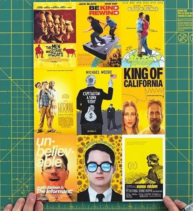
We feel like everyone already kind of knows this, but it’s still interesting to see the guy who created the posters for Pulp FicColtion, Ocean's Eleven, Girl, Interrupted, and Training Day, (plus many many more) break down the colour theory and design of movie posters.
Two key takeaways:
1. When you’re marketing your next indie film, yellow is a cheap way to catch the eye.
2. Always use the face of Tom Cruise if he’s in your film. If he’s not in your film you should probably still give it a go anyway.
And because this is the internet, there is always someone who took the colour science a step further, like Vijay Pandurangan who analysed 35,000 movie posters spanning 1914-2012 to prove his theory that they were become darker and more blue.
They were. Click the poster to check out how he pulled off his experiment.
This is also the second post in a row to feature Tom Cruise, we’l see what we can do about a third.
ほかの記事
- 給水塔、大捜索空を見上げる、とてもいい理由。ちょっとくらい夢中になっても、まったく問題ありません。
- ザンジバル・バッグ一枚の帆布の切れ端を、何年も取っておいた理由。
- ダイヤルを、少し戻す子どものための、画面のない固定電話(もしかすると、私たち大人のためにも)。
- Helveticaへの愛ゆえにひとつの書体は、すべてを統べる。その理由を説明させてください。