美しい
フォントと
本文
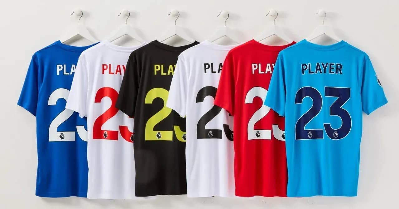
For all those who love fonts and football or typography and soccer then this video is a great eye-opener for how much goes into designing the names and numbers on the Premier League shirts, and how seriously they take updating one of the most viewed designs in the world.
The ‘re-branding’ was never going to be revolutionary, but the care and effort that goes into the opportunity is still exceptional.
Our key takeaways:
1. The testing phase is phenomenal and organizing full football games with floodlights, televised coverage and commentators to evaluate the design is about as thorough as you could be.
2. It’s pretty cool listening to football commentators commentate on graphic design like it’s a game.
Maybe it should be?
3. When you add AI and digital technology to the mix the obvious question is - what’s next? How far does digital technology allow us to go with shirts, names and numbers?
4. Having a factory in Norway is pretty impressive when it comes to sustainability and producing stuff somewhere beautiful, especially when your numbers get into the millions.
ほかの記事
- 給水塔、大捜索空を見上げる、とてもいい理由。ちょっとくらい夢中になっても、まったく問題ありません。
- ザンジバル・バッグ一枚の帆布の切れ端を、何年も取っておいた理由。
- ダイヤルを、少し戻す子どものための、画面のない固定電話(もしかすると、私たち大人のためにも)。
- Helveticaへの愛ゆえにひとつの書体は、すべてを統べる。その理由を説明させてください。