For the love of Helvetica
Every designer has a relationship with Helvetica.
Ours?
Love. Maybe obsession. It’s never let us down and it never will.
Despite countless new typefaces joining the world every year, Helvetica remains one of the most enduring and influential pieces of design ever created. You’ll find it on everything from business cards to buildings, exhibition graphics to highways signs. It’s definitely the greatest thing the Swiss ever gave the world.
It’s also 70 years old, which definitely puts it in the “timeless’ catagory. Designed in 1957 by Max Miedinger with input from Eduard Hoffmann, it’s so Swiss that it’s actually named after Switzerland, with “Helvetica” coming from “Helvetia”, the Latin name for Switzerland. Good facts.
Why’s it so good?
Helvetica isn’t trying to express any kind of strong personality, it’s not trying to make a statement or to attract any attention. Unlike so many decorative typefaces out in design-land it’s not trying to be friendly, historic, bold or futuristic, it’s just doing its job.
And that job?
To be missable, to say “don’t look at me, look at the content”. It’s functional, a clear window to whatever is being said. It's a typeface designed to be neutral, objective, and almost invisible and that’s why it works so well for functional design, because it does it's job better than any other typefact.
It wasn't created to express personality or attract eyeballs, and yet it’s become one of the most recognisable design elements in the world.
We’re fans, and so are a lot of other people.
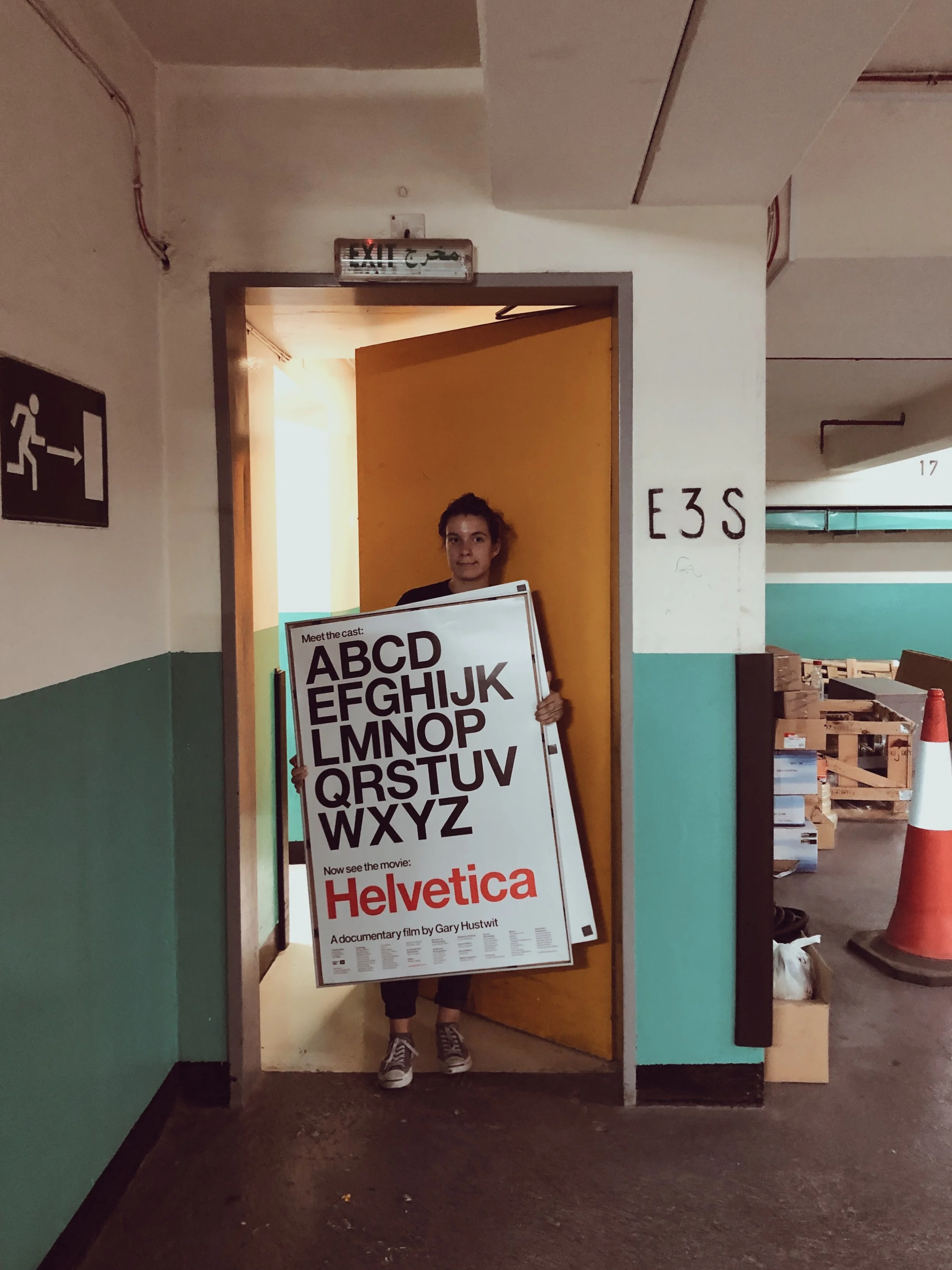
Want to go deeper? We’d highly recommend the 2007 Helvetica documentary by Gary Hustwit
And there are an endless amount of Helvetica vids on Youtube, but might we recommend this one.